
Introduction
I joined an italian start up in its early stage to assist with initial research, benchmarking, feature definition and prototype.
The start up intends to create an innovative payment system using the smartphone and bypassing any POS/Payment machine, its USP being to "cut any tertiary cost" and benefit small and medium businesses while providing an additional choice of payment tool to the buyers.
The result at this stage is a prototype of the MVP to use for test purposes and to gain funding.
The start up is sponsored by several italian institutions, such as "Bocconi for Innovation", "Sardegna ricerche", and already has funding from the EU and the Italian government.
The following case study covers two months' (July-August 2022) worth of work and the project is still ongoing.
My Role
UX Researcher, Designer, UI Designer
Tools
Figma, Jotform, Pollfish, Cosmos for collaboration
Deliverables
Mobile web app freemium prototype and UX deliverables
The process
Gather the assumptions and initial research from the stakeholders;
Validate the assumptions and gather new data through quantitative & qualitative data (online surveys)
Benchmarking;
Define user personas (buyers and merchants)
Define features and design user flows;
Use brand identity to create responsive design;
Deliver prototype for 2 versions of the app: for merchants and for buyers.

The Problem
It all starts with the strong resistance toward electronic payment in Italy: only recently, it became mandatory for merchants to have a POS to allow customers to pay with a credit card. this is mostly due to the high costs the merchant has to sustain in order to offer this payment method.
Merchants are frustrated and always looking for an alternative to still satisfy their customers' needs while cutting their losses.
Buyers only like to use an extremely easy and secure payment method such as credit cards but are also used to paying with their smartphones.
The business idea is to have "merchants and buyers on the same side" with an innovative tool as an alternative to credit card payments, which would cut down credit card commissions becoming a bridge between the Merchants and the Buyers becoming a payment institution on the model of SEPA payments.
The Solution

Together with my teammate UX Designer, we came up with a definite list for the MVP needed by the stakeholders to obtain further funding prior to launch. The result is an easy-to-use freemium web app with the user experience in mind while satisfying 100% the stakeholder's needs.
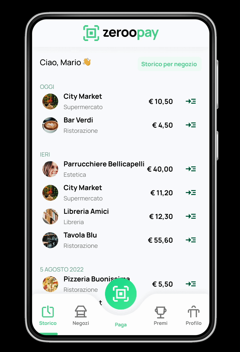
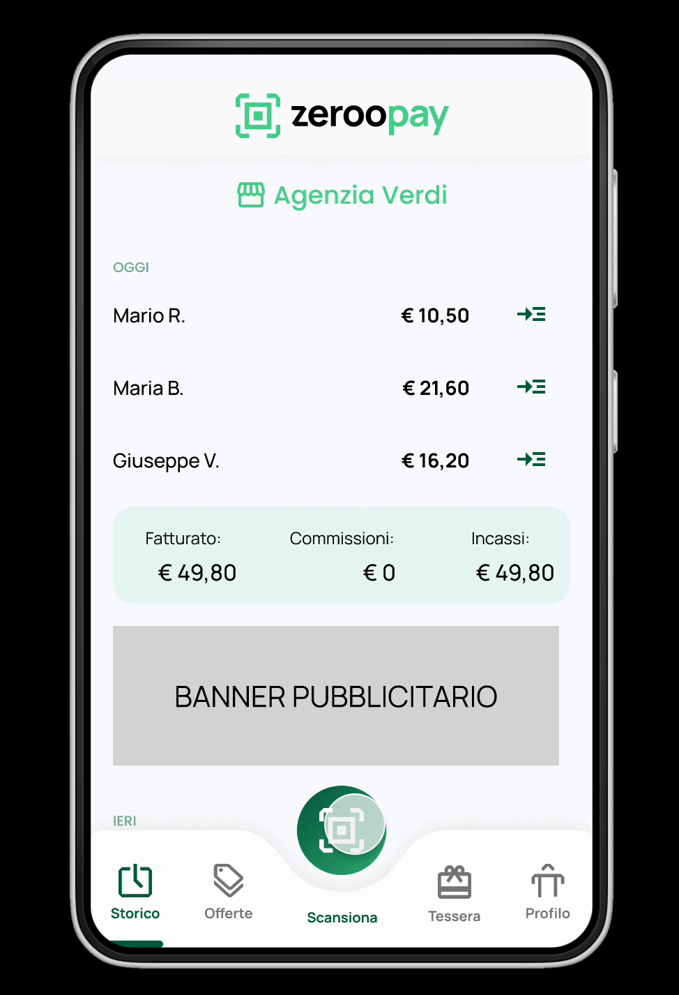
1. Accessible navbar with the main QR generator/reader always on hand;
2. Double view for the marketplace (map and filtrable list) to serve the buyer who uses the platform;
3. Marketing tools for themerchants: creation and management of a fidelity card and personalized offers;
4. a system to keep the buyers hook: reward catalog and point system
How it works
During check out in person, the buyer opens the app and generates a QR code. The merchant opens the app which has the function to read the QR code and therefore link to the buyer's profile. The merchant then digits the total amount of the purchase and sends a payment request. The buyer receives the request and accepts it. The transaction is complete: the money will leave the buyer's bank account and will reach the merchant's account. The payout happens on a regular basis, set up by the merchant.
Research
We started with a competitive research to benchmark the most important features and understand the market.
The stakeholder already had some ideas for the MVP, but this process allowed us to really think about what's already out there and what's missing.


There was an assumption given to us by the stakeholders that we would need to verify, along with others:
"Customers are willing to use another payment tool in order to let the merchants not pay a fee per transaction"
So we decided to prepare two surveys, one towards the buyer user segment and one toward the merchant user segment (our first proto-personas) with different questions aiming to really understand what THEY want and see if the stakeholder assumption was correct.
Spoiler: it wasn't.
The forms where set up in Jot Forms and then submitted to the user segments via Pollfish.

Findings
The pain points and key takeaways uncovered are as follows:
MERCHANTS: they would use a different payment method if this would really allow to cut costs (main pain point); they would be willing to pay a fixed fee for this service.
BUYERS: they aren't really motivated to use a different payment method other than cards and cash: they'd use it only if there were something in return.
For both it emerged TRUST as the main paint point when using a new, unknown, payment method. We needed to work with that in mind.
Personas
Using real data from the survey, 4 main personas emerged:
-
The wary merchant,
-
The experienced merchant,
-
The reluctant buyer,
-
The curious buyer.


Architecture and User Flows
After the research we started an ideation and definition phase in order to set in stone what we wanted to include in the MVP and have an idea of how everything should work.


Design and prototype
As for many start up reality, the key is working fast (and not using up too many costly work hours!). For this reason we proceeded directly with the high fidelity mock up which I then prototyped in order to have a usable deliverable ready to test, validate, and use for business purposes.
I chose to use the smallest screen size for my design to increase accessibility on newer devices.

Design System
I implemented a design system as I designed, using Figma components and variants: in this way, any future change will be applied easily throughout the design and everything stays recorded and will always maintain consistency while being ready to use.


User testing
For now, we had the opportunity to test the prototype with 2 users, and we hope to test more in the future.
These tests however were really precious in order to get quick fixes to the usability.
The testing was done remotely using Google Meets, asking the user to share their screen while following a number of tasks while I was moderating and my coworker was recording the session and taking notes.
I created a single flow for each task to avoid distraction, but at the end of the testing session, we had the user play around with the full prototype to gather more spontaneous feedback.

Takeaways & Next steps
Due to confidentiality, I couldn't share here the prototype or other details concerning this project but I hope that the overall approach is clear enough. Hopefully I will be able to share real links once launched!
This project is still ongoing and I can't wait to keep testing the prototypes with real users and seeing them
implemented. The roadmap sees the first launch towards the beginning of 2023: there's still a lot of work to do.
The web app it's still missing its premium version designed (without the limitations of the freemium), so that would be our next step design-wise.
This experience really showed the importance of collecting and analyzing real user data prior to any business and design decision and I'm glad to have the opportunity to use my skills and experience to affirm the importance of user experience design for a new product.
